April 15, 2013

Welcome to my new blog!


Sorry friends, its been four months since I posted in this blog until now.

Because, I was looking to take this learning platform to a much more professional level with a self hosted domain name and with much features that a normal blogger platform cannot do. Hope you can understand!

Now, I introduce you to my new blog Bricks of Web (http://bricksofweb.com).

In my new blog, I'm trying to make tutorials that any beginner can understand and practice their coding skills. And if you like my new blog please do follow them from the resources available below,

Cheers and happy coding!

November 28, 2012

Understanding Inheritance in CSS


Inheritance in CSS

Mostly CSS style that is applied to an element is also inherited to its descendants. Just like humans inherit skin color, height, baldness etc... from their parents and grandparents. In this post, lets try to understand why certain styles are inherited and why some or not.

Why elements are inherited?

why_inheritance_is_applied_in_CSS

Because, inheritance is big time saver. Imagine a webpage containing thousands of elements which needs to be styled, and to style them individually is a heck to work. It is only because of this inheritance property in CSS, we save a lot of time.

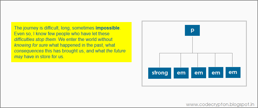
Let us see an example to understand this,


<!-- this is HTML -->
<p>The journey is difficult, long, sometimes <strong>impossible</strong>. Even so, I know few 
people who have let these <em>difficulties stop them</em>. We enter the world without
<em>knowing for sure</em> what happened in the past, what <em>consequences</em> this has 
brought us, and what <em>the future may</em> have in store for us.</p>


/* this is CSS */
p {
   color: #069;
   background-color: yellow;
   padding: yellow;
}

You can see in the above code, the color of the paragraph tag(p) is changed. But, the color property is also inherited to its descendant selectors like strong and em's. Imagine if there is no inheritance then we need to style each and every element in a webpage.

Limits of Inheritance

Some CSS properties do not inherit their values on to their descendant elements for good,

  • Properties that affect the placement of elements on the page like margins, padding, background color, borders of elements are not inherited.
  • Every browsers have their own default property style for some elements. Elements like headings, anchor links have their own predefined styles like have bigger font-size or coloring the link to blue etc...
  • Some times multiple styles conflict to apply style to a single element. In those cases, it depends on certain inheritance rules.

November 26, 2012

Attribute selectors in CSS


Attribute selectors are used to style items using the attribute of elements rather than targeting tag elements in HTML. This gives you another way or opportunity to style the similar tags with different attributes.

ALSO SEE: Targeting tags within document hierarchy

1. Targeting Attribute

This will simply target the attribute of the tag. So now, the elements under this attribute will be styled accordingly.


<!-- this is HTML -->
<img src="keepcalm.png" width="500" height="300" />
<img src="keepcalm.png" width="500" height="300" title="Keep Calm" />


/* this is CSS */
img[title] {
    border: 3px solid red;
}

Form the above code, you can see that the image with title attribute is styled accordingly to the CSS but the same image without title attribute doesn't.

2. Targeting Exact Value

We now know how to style an element according to its attribute, but we can also style an element according to its attribute values. Let us see how to target exact attribute values,


<!-- this is HTML -->
<p><a href="http://codecrypton.blogspot.in">CodeCrypton - Home</a></p>
<p><a href="http://codecrypton.blogspot.in/p/html.html">CodeCrypton - HTML</a></p>
<p><a href="http://codecrypton.blogspot.in/p/css.html">CodeCrypton - CSS</a></p>


/* this is CSS */
a[href="http://codecrypton.blogspot.in/p/html.html"] {
    background-color: #000;
    color: #fff;
    text-decoration: none;
}

You can also style the webpage according to the attribute values as explained above. The specified value must be exactly equal as in attribute.

3. Targeting value within spaces

As we know to target exact attribute values, let us learn how to target attribute value words within spaces here,


<!-- this is HTML -->
<p title="This blog name is CodeCrypton">Code Crypton is a programming blog that focuses on 
building webpages.</p>


/* this is CSS */
[title~="blog"] {
    background-color: orange;
    color: #069;
    width: 400px;
    padding: 10px;
}

By using the tilde ( ~ ) symbol, now you can target value words that are within spaces.

4. Targeting values within dashes

Now, just like styling attribute values within spaces, now we can style attribute values that are within dashes. Lets learn about that here,


<!-- this is HTML -->
<p title="this-blog-name-is-codecrypton">Code Crypton is a programming blog that fouces on 
building webpages.</p>


/* this is CSS */
p[title|="blog"] {
    background-color: yellow;
    color: #069;
    width: 400px;
    padding: 10px;
}

Now by using the vertical bar ( | ) symbol, we can style the attribute value within dashes.

5. Attribute beginning with certain value

If you remember attribute value starting with certain words, then you can use the caret (^) symbol. See how it works below,


<!-- this is HTML -->
<h1 rel="Code Crypton Programming Blog">Code Crypton</h1>


/* this is CSS */
h1[rel^="Code"] {
    color: #069;
}

6. Attribute ending with certain value

Just like previous example, if you remember attribute value ending with certain words, then you can use the dollar ($) symbol. Look below how it works,


<!-- this is HTML -->
<h1 rel="Code Crypton Programming Blog">Code Crypton</h1>


/* this is CSS */
h1[rel$="Blog"] {
    color: green;
}

7. Targeting certain values somewhere

If you only remember some phrases of value name but don't know the exact position of these phrases inside the value, then follow the code below,


<!-- this is HTML -->
<h1 rel="Code Crypton Programming Blog">Code Crypton</h1>


/* this is CSS */
h1[rel*="programming"] {
    background-color: #333;
    color: rgb(210,233,255);
    width: 215px;
    padding: 10px;
}

When you use the star/multiply (*) symbol, then you can target certain attribute values somewhere inside like the above code.

8. Using multiple attributes

So far, we have only seen styling elements with one attribute. But if needed, you can use even two or more attributes to style an element for better styling.


<!-- this is HTML -->
<h1 rel="multiple" title="attribute selector">Multiple attribute selector</h1>


/* this is CSS */
h1[rel*="multiple"][title$="attribute selector"] {
    color: #069;
    background-color: #fff;
    border: 1px solid orange;
    border-radius: 9px;
    width: 400px;
    padding: 10px;
}

From the above code, you can see how a single element's attributes are used multiple times to style an element.


Related posts:

November 22, 2012

Basic Pseudo-elements in CSS


Pseudo-elements are another CSS selectors that is used to style the HTML elements. It contains pseudo selectors like first-letter, first-line which are used as styles and also :before and :after selectors which are used to insert additional texts into the HTML elements. Note that, this style cannot be applied on inline styles.

1. First-letter

In various newspapers and magazines, you may have come across the typographic effect where the first letter in the starting paragraph would appear bold, big and also with different font style. Similarly, the :first-letter pseudo-element gives you the functionality to style the first or starting letter of the element that is denoted.


#firstpara:first-letter {
    font-size:300%;
    color: orange;
}

You can see that the first letter in the paragraph has changed according to the style applied.

2. First-line

The first-line pseudo element is a style that can be applied to the first line of the element.


#firstpara:first-line {
    font-variant: small-caps;
    color: green;
}

You can see the changes that happened to the first line in the paragraph.

3. Before and After

The :before and :after pseudo elements are used to add texts before or after the specified element. In the course, this is now also used for many style functionalities.


<!-- This is HTML code -->
<p id="para">, your age is </p>


/* This is CSS code */
#para:before {
    content: "Balaji";
    color: green;
}

#para:after {
    content: "21.";
    color: green;
}

You can see from HTML code, where there is only ', your age is ' texts. Then the :before pseudo-element applies the 'Balaji' texts before the HTML content and the :after pseudo-element applies '21.' after the HTML content.

Note that it is mandatory to use the 'content' property in before and after pseudo-elements, or it would have no value in CSS styles.

November 21, 2012

Basic Pseudo-classes in CSS


Pseudo classes are CSS styles that is applied on HTML elements. They give some functionality to the HTML element either statistically or dynamically with or without certain physical movements by using mouse pointers etc. But, you must understand that this style cannot be used as inline styles.

1. Hover

Hover pseudo-class is most popularly used in anchor links. But this pseudo class can also be used in other HTML elements.


p:hover {
    background-color: yellow;
}

The above code explains how a paragraph has a normal state but changes its current state when the mouse pointer hovers or moves around that particular element. This can similarly be applied to other elements in HTML.

2. Focus

Well when hover pseudo class is used for dynamic mouse movements, focus pseudo class can be used as dynamic selectors with either tab or mouse clicks for a particular element.


a:focus {
    background-color: orange;
    color: #333;
    text-decoration: none;
}

Other than link elements, focus pseudo-class can also be used in forms. They are mostly used under input elements, textarea, etc...


input:focus , textarea:focus {
    border: 1px solid orange;
    background-color: yellow;
}

Due to inconsistencies among different browsers and adaptability to various devices, it is better to use focus pseudo-class with other close relational pseudo-classes like hover and active. This gives flexibility and credibility to the styles you apply.

An example style will look like,


a:hover,a:focus,a:active {
    background-color: orange;
    color: #333;
    text-decoration: none;
}

3. First-child

First-child pseudo-class helps to style the first element along its identical sibling elements.

Let's look an example HTML code first,


<p><strong>Love</strong> doesn't make the world go around. <strong>Love</strong> is what makes 
the ride worthwhile.</p>

Now applying first-child pseudo element on the strong element,


p strong:first-child {
    color: orange;
}

You can see that the style applied is only applied on the first strong attribute and not the second one because of the first-child pseudo-class.

November 16, 2012

Understanding classes and ID


Classes and ID's give more flexibility to style only the required tags from many similar element properties. You may want all the p tags in a webpage to have similar styles, but if a necessity arises to style some particular p tags, then we need to use classes or ID's. These classes and ID's, when mastered gives wide possibilities of styling your webpage.

Using Classes

To apply class to HTML, you need to add class attribute to the specific elements that you need to style. The value for this attribute can be any name that you define.


<p class="color">   some texts missing...   </p>

<p>   some texts missing...   </p>

<p class="color">   some texts missing...   </p>

Things to remember when applying class to HTML,

  • The class value must start with a letter.
  • Class name must only have letters, numbers, hyphens and underscores.

Now, let's see how to apply styles to classes


.color {
    width: 500px;
    color: orange;
}

Things to remember when using classes in CSS,

  • To define a class in CSS, it must always begin with a period and that's how web browsers spot a class selector in the style sheets.
  • After the period, the class name must be same as it is used in HTML.
  • Class names are case-sensitive. That means .color is different from .COLOR.

Now the styles are applied only to the specified class names. In this way, classes can be applied to any element in HTML including div and span.

Using ID's

Just like classes, ID's also have similar functionalities. But the difference arises in where and when we should use our ID's. Otherwise, ID's are used for some simple Javascript solutions.


<div id="footer">

     <!-- some codes missing -->        

</div>

Things to remember when applying an ID to HTML,

  • The ID name must start only with a letter and can have letters, numbers, hyphens and underscores(just like classes).
  • Identify and use ID's on the unique parts that occurs only once per webpage, like a header, footer, etc...

Note: Even if you apply an ID to multiple elements in HTML, the browsers won't blow up and it will also style correctly. But this is certainly a very bad practice and you must stop doing it.


#footer {
   border-radius: 3px;
   background-color: #ccc;
   color: #333;
}

Things to remember when using ID's in CSS,

  • The ID's must be defined by starting with a hash symbol in the style sheets.
  • Then the ID name must be same as in the HTML.
  • ID names are case-sensitive. That means #footer is not same as #FOOTER.

Using Multiple Classes and ID's to a single element

Sometimes, an HTML element needs to hold multiple classes or ID's as attributes. In those cases you can use another class or ID name in the same attribute with a space inbetween those values. This rule can be applied for multiple values similarly.


<p class="color box">
     <!-- some codes missing -->
</p>

<div id="home tabs">
     <!-- some codes missing -->
</div>

In the above code, two class names color and box are defined in a single attribute and similarly two ID names home and tabs in a single ID attribute.

November 2, 2012

Containing the box size


Containing the width of a box to a fixed size is really important while making a webpage. But setting the width and adding padding, borders and margins makes the box larger than the actual size. This tutorial will give a technique that makes the box to contain within a fixed size.

Situation and problem

To understand the situation, let us make a box element and set a width of 180 pixels. Now add padding of 10 pixels and border of 5 pixels. Now the box becomes 210 pixels.


p {
  width: 180px;
  padding: 10px;
  border: 5px solid #069;
}


As you see above the width do not contain but expand, but this now will become a problem when you need to contain the box to give some space to the other boxes in a webpage.

Consider two contents of 180 pixels wide which needs to fit into a 380 pixels wide container which is easily possible and that also leaves another 20 pixels of space. But after applying padding and borders, it seems that it is impossible now to fit into the container.

Solution to this problem

The solution to this can be solved by placing the element inside a div tag and setting a width to it. Now, even if the element inside this div tag add padding, borders or even margins it will be contained within the outer div tag's width.


div.container {
    width: 180px;
}

p {
    margin: 10px;
    border: 5px dashed #069;
    padding: 10px;
}

Now by using this outer div containers, you can set a fixed size to any element and the box do not change size.

November 1, 2012

Vertical Margins Collapse


Margins that meet horizontally is different from margins that meet vertically. Horizontal margins work normally and they do not collide each other. But vertical margins collide each other and they leave the space of a small margin.

Setting the Margins


box_a {
     margin-bottom: 30px;
}

box_b {
     margin-top: 50px;
}

For experimenting vertical margins collapse, we are now creating a margin bottom for Box A with 30 pixels and creating a margin top for Box B with 50 pixels.

Collapsing the Margins

The Box B's 50 pixels top margin now touches the Box A's bottom margin and penetrates the Box A's content until 20 pixels within the content. After that, the Box A's bottom margin of 30 pixels stops the penetration. This is called collapsing of margins and this happens only vertically but not horizontally.

October 31, 2012

Calculating box size


Calculating box size is very important when placing the box inside another box. This helps in designing the wireframe for a website and adjusting the box contents for a best design. And moreover, calculating horizontal box size is more important than vertical box size because horizontal scrolling is the biggest enemy of web developers and designers. Here we are going to calculate the horizontal box size of an element.

Width of a content

A content is an element which can be either a text, image, video or any media type. When the width property is applied to the content then it follows the width that is set on it.

Adding Left and Right Padding

Along with the width of the content you must add the left and right padding size of that element.

Adding Left and Right Borders

Then the borders are also important when calculating the size of a box. So, you must add the left and right border size.

Adding Left and Right Margins

Though margins are outside border and invisible, left and right margins must also be added as it plays a major role in positioning the content.

Total box size

The total box size includes the content width, left and right padding, left and right borders and left and right margins. Each and every element box size must be calculated in this way for a better web design.

October 30, 2012

Borders, Padding and Margins on required sides


Borders, Padding and Margins can also be applied only to the required sides of an element. This is possible by combining the top, right, bottom and left properties with the box model properties.

Borders on required sides


p {
    padding:1em;
    width: 300px;
    
    border-top-width: 5px;
    border-top-style: dashed;
    border-top-color: teal;
    
    border-right-width: 1em;
    border-right-style: groove;
    border-right-color: #069;
    
    border-bottom-width: 5px;
    border-bottom-style: dotted;
    border-bottom-color: orange;
    
    border-left-width: 9px;
    border-left-style: solid;
    border-left-color: green;
}

You can see from the above picture that the borders on each side of the content is unique, and it's because of the mixing of the position properties(top, right, bottom and left) with the border properties(width, style and color). This now helps to style the borders on each sides individually.

As the above code contains a bit lot of work, you can use border shorthand property combining with positioning properties.


border-top: 5px dashed teal;
border-right: 1em groove #069;
border-bottom: 5px dotted orange;
border-left: 9px solid green;

Padding on required sides


p {
    border: 5px solid teal;
    width: 300px;
    
    padding-top: 1em;
    padding-bottom: 25px;
    padding-left: 1.5em;
}

Similar to mixing of position properties to borders, padding can also be applied to the required sides. If any side is left out, then padding do not apply to that side.

Margins on required sides


p {
    border: 5px solid teal;
    width: 300px;
    
    margin-top: 30px;
    margin-right: 1.5em;
    margin-bottom: 25px;
    margin-left: 18px;
}

After borders and padding, now we have seen how to make margin space on only the required sides.

Shorthand Styling of borders, padding and margins

Instead of using top, right, bottom, left values on borders, margins and padding you can use the shorthand styling which reduces a much lot of code.

Applying four values


p {
    width: 300px;
    border-style: solid dashed double dotted;
}

The four values(top, bottom, left and right) can be presented now in a single shorthand property like the code above. The first(solid), second(dashed), third(double) and fourth(dotted) value gives the top, right, bottom and left values respectively in a clockwise order.

Applying three values


p {
    width: 300px;
    border-style: solid dashed double dotted;
    border-color: yellow #069 orange;
}

Here the first value(yellow) define the top border, the second value(#069) defines the right and left borders and the third value(orange) define the bottom border.

Applying two values


p {
    width: 300px;
    border-style: solid dashed double dotted;
    border-color: yellow #069 orange;
    border-width: 0.9em 0.3em;
}

In this above code the border-width property has two values, where the first value(0.9em) defines the top and bottom borders and the second value(0.3em) defines the right and left borders.

Similarly, just like borders you can also use this shorthand property to padding and margins, like below


p {
    width: 300px;
    border-style: solid dashed double dotted;
    border-color: yellow #069 orange;
    border-width: 0.9em 0.3em;
    padding: 50px 3em 1em;
    margin: 30px 20px;
}

October 26, 2012

Creating Padding and Margin in CSS


After understanding what is padding and margin, we need to know how to do and apply it to the elements in HTML. This is achieved using the padding and margin properties in CSS.

Creating Padding

To create a padding, you need to apply the padding property to the selector, of where the element is present. The values should be in numerical values or units or in percentage.


p.one {
  border: 3px solid #069;
  padding: 1em;
}

p.two {
  border: 3px solid #069;
  padding: 25px;
}

The default padding varies according to different browser.

Creating Margin

The margin property helps to space the content from the other contents inside a webpage and so it adds space outside the border. The margin CSS property helps to do this job. The values can be numerical or units or in percentages as like padding property.


p.one {
    float:left;
    border: 3px solid #069;
    padding: 25px;
    margin: 1.5em;
}

p.two {
    border: 3px solid #069;
    padding: 25px;
    margin: 1.5em;
}

In the above picture, the two paragraph contents are spaced 3em, with each paragraph's margin containing 1.5em space. Without the margin property the two paragraph contents will touch each others border.

October 25, 2012

Styling Borders in CSS


Border is a line that runs around an element. Initially border is invisible, but it can be made visible using certain CSS properties. The flexibility of border properties can also be used to make designs around the element. One can control three different properties of each border,

  1. Width
  2. Style
  3. Color

1.Width


#em p {
     border-width: 1em;
}

#em p+p {
     border-width: 2em;
}

#unit p {
     border-width: thin;
}

#unit p {
     border-width: thick;
}

The border width property sets the width of the border. The width can be given in text values like thin, medium or thick. This value can also be numerical like ems, px, percentage and so on.

2.Style


p.solid {
      border-style: solid;
}

p.dashed {
      border-style: dashed;
}

p.dotted {
      border-style: dotted;
}

p.groove {
      border-style: groove;
}

p.ridge {
      border-style: ridge;
}

p.inset {
      border-style: inset;
}

p.outset {
      border-style: outset;
}

p.none{
      border-style: none;
}

p.hidden {
      border-style: hidden;
}

The border style property determines the style of the border with various styles like solid, dashed, dotted, double, groove, ridge, inset, outset, none and hidden. The difference between the hidden and none, is that the hidden value do not allow other borders into the content when collapsing borders. The default style property is solid. The style property is much useful in designing the elements in a webpage.

3.Color


p.keyword {
     border-color: orange;
}

p.rgb {
     border-color: rgb(99,99,99);
}

p.hex {
     border-color: #069;
}

Border color is used to color the border. The values can be of any keywords, RGB value or hexadecimal values.

DEFAULT BORDER VALUES: Of the three border properties(width, style and color) border style is the only mandatory property. If the border width is not applied, then it takes the default medium value. And the default border color is the color property applied to that element, when border color is not defined.

Border Shorthand property

The border shorthand property makes the width, style and color styles applied in a single border property. This helps in minimizing the code when applying CSS styles to the HTML element effectively.


img {
   border: 3px dotted #069;
}